If you’re familiar with NASA traditions, you know how important mission patches are to each program and crew. A painstaking amount of thought and planning goes into the design and meaning behind each emblem, including the new Artemis Program identity.
This summer NASA unveiled the Artemis program logo, a bold look that embodies the determination of the men and women who will carry NASA’s missions forward.
Named after the mythological Greek goddess of the Moon who was also the twin sister of Apollo, the Artemis Program aims to land the first woman and the next man on the Moon by 2024.
This new identity draws inspiration from the Apollo program logo and mission patch. Using an “A” as the primary visual and a trajectory from Earth to the Moon, we honor all that the Apollo program achieved. However, through Artemis we will forge our own path, pursue lunar exploration like never before, and pave the way. As the “torch bringer,” literally and figuratively, Artemis will light our way to Mars.
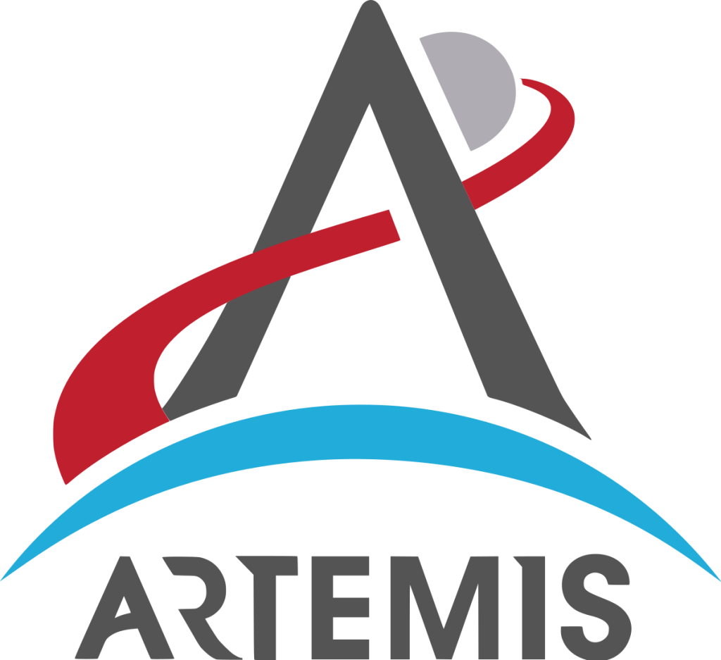
The A symbolizes an arrowhead from Artemis’ quiver and represents launch.
The tip of the A of Artemis points beyond the Moon and signifies that our efforts at the Moon are not the conclusion, but rather the preparation for all that lies beyond.
The crescent of the Earth at the bottom shows missions from humanity’s perspective. From Earth we go. Back to Earth all that we learn and develop will return. This crescent also visualizes Artemis’ bow as the source from which all energy and effort is sent.
The trajectory moves from left to right through the crossbar of the “A” opposite that of Apollo. Thus highlighting the distinct differences in our return to the Moon. The trajectory is red to symbolize our path to Mars.